cg-select
CG-SELECT
version ~ 0.2.2
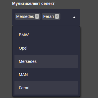
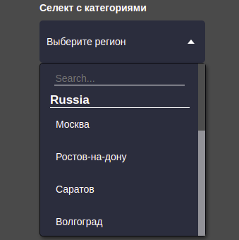
This component allows you to create a custom select. It offers more flexible customization and use of select. Customization, multi-selection and live search by elements are available.
The ability to customize basic elements, such as:
- Select button.
- List with select elements.
- Placeholder.
- In the multiselect mode, customization of chips (selected elements) is available.
- Label of the element (if it was specified).
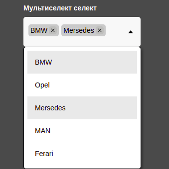
- Switch themes from dark to light.
Installation
npm i cg-select
Usage
To create a component, you need:
- Create a regular button element.
- Give it the cg-dropdown class.
<button class="cg-dropdown"></button>
- Give it a unique class, e.g. (cg-dropdown_categories).
<button class="cg-dropdown cg-dropdown_categories"></button>
- Create a new instance of the class (new CGSelect)
- Pass all desired settings as an object
All options for creating and managing are in the documentation, section "CGSelect class constructor".
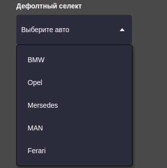
An example of creating a regular select.
import CGSelect from 'cg-select';

const dropdown = new CGSelect({
  selector: '.cg-dropdown_selector',
  placeholder: 'Выберите авто',
  items: [
    'BMW',
    {
      id: '213sade',
      title: 'Opel',
      value: 1,
    },
    'Mersedes',
    'MAN',
    'Ferari',
  ],
});
Example of different selects
Same working example -- https://cg-select.itguild.info/


All documentation on CG-SELECT is located in the folder of the same name. The documentation describes all methods and variables, there are also examples of passing settings to select. You can also open it on the page with an example, or follow the link below.
Contributing
- Fork it!
- Create your feature branch:
git checkout -b my-new-feature - Commit your changes:
git commit -am 'Add some feature' - Push to the branch:
git push origin my-new-feature - Submit a pull request :D
Compatibility
| Application Compatibility | JS | React | Angular | Vue |
|---|---|---|---|---|
| CG-SELECT |

|


|

|

|
| Comment | Tested in Js applications and it worksуспешно. |
Works only with a crutch in the form setTimeout()
|
not yet available | not yet available |
History
16.12.2022 - release version 0.1.0!
00.00.2023 - upgrade to version 0.2.1